LinkToLooks · Guides · Creator Desk
Creator Desk
How do you make a media kit that a brand actually reads?
Part of: The business of being a creatorFor creators
A media kit is a one-to-two page document that answers three questions for a stranger: who your audience is, what you can make, and how to reach you. It is a sales document, not a portfolio.
The single most common mistake is optimising it for how it looks rather than for how fast it can be skimmed by someone with forty of them open.
What a media kit is actually for
Someone brand-side has a budget, a deadline and a shortlist. Your media kit exists to move you from the long list to the short one, and it gets perhaps ninety seconds to do it. That is the entire job. It is not there to express your aesthetic, and it is not a portfolio — the portfolio is your account, which they will open in another tab regardless.
Two consequences follow, and almost every weak media kit ignores both:
- Everything that cannot be verified is discounted. A reader who cannot check a number treats it as a claim. Numbers with their denominators named survive that discount; numbers without them do not.
- Anything that delays the audience data is working against you. A page of philosophy before the first number is a page the reader scrolls past, and some of them stop scrolling.
What a brand reader opens first

Order beats content here. A kit with mediocre numbers in the right order outperforms a kit with good numbers buried on page two, because the second one is never reached.
Put the identity line first
- Your name, what you cover, and the platforms you actually post to — in one sentence.
- Not a tagline. A tagline tells a stranger nothing they can act on.
Then the audience, with denominators
- Follower count per platform, and the date you measured it.
- Engagement rate and the formula you used. There are several in common use and they disagree with each other by a wide margin on the same account.
- Reach or views per post, stated as an average over a named period rather than a best month.
Then who those people are
- Top countries with percentages. A retailer that ships to one country cares about this before it cares about your reach.
- Age bands and gender split, straight from your platform analytics.
Keep reading →
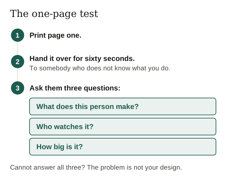
The one-page test
Here is a test worth running on whatever you have now. Print page one. Hand it to somebody who does not know what you do. Give them sixty seconds, take it back, and ask them three questions: what does this person make, who watches it, and how big is it?
If they cannot answer all three, the problem is not your design. It is that the information they needed was not on the page they read.
Our own editorial view, and it is not the fashionable advice: most creators should ship a one-page kit. Two pages is a concession you make when you genuinely have a body of relevant past work to show. Three pages is almost always the sign of a kit built to look substantial rather than to be read.
Section by section, what to put in
Audience make-up
- Country split, top three, with percentages and the date.
- Age bands and gender split.
- If your audience is unusually concentrated — one city, one profession, one hobby — say so. Concentration is worth more than size to a brand with a narrow product.
Performance, honestly framed
- Give the follower-based engagement rate first, then the reach-based one beside it with reach named. Two numbers with their denominators stated reads as someone who understands their own analytics.
- Saves and shares deserve their own line if they are strong. For product content they say more about buying intent than likes do.
- Use an average over a stated period. A single best-performing post is not a performance figure and a brand-side reader knows it.
Past work, if it is relevant
- Two or three examples, chosen for relevance to the brand you are sending it to, not for the numbers they did.
- Say what you made and what it was for. Do not claim a result you cannot evidence.
Deliverables and contact
- The formats you actually produce, listed plainly.
- One email address. Not a form, not a link tree, not three options.
The sections that waste a page

Two of those deserve naming outright, because they are so common:
- The logo wall. A grid of brand marks implies commercial relationships. If they were gifted posts or unpaid mentions, a brand-side reader who checks will find out, and you have spent your credibility on decoration.
- Undated follower counts. A number with no date is a number from whenever it was most flattering. Dating it costs you nothing and removes the suspicion.
What to do when your numbers are small
Small accounts are not disadvantaged in this document as much as they assume. What a small kit must do differently is compete on something other than size, and there are only really three candidates:
- Concentration. A tightly defined audience is easier to sell than a large vague one. Say exactly who follows you.
- Behaviour. Saves, shares and comments that show intent rather than approval. Show the raw counts, not just a rate.
- Relevance. A kit tailored to the brand, referencing their actual products, beats a generic kit from a bigger account more often than creators expect.
A checklist you can work through
Work down this once before you send anything. Every line is a yes or a fix.
- Page one states who you are and what you cover in one sentence.
- Every audience number carries the date it was measured.
- Every rate carries the formula and the denominator it used.
- Reach and views are averages over a stated period, not a best post.
- Country, age and gender splits are present with percentages.
- Past work is chosen for relevance to this recipient.
- No result is claimed that you could not evidence if asked.
- No logo appears for a relationship that was not commercial.
- Deliverables are the ones you can actually produce this month.
- Exactly one contact route, and it works.
- The file is a PDF, named with your name and the date, under about 5 MB.
- It reads correctly on a phone, because a good share of recipients will open it on one.
Last verified 1 September 2026. This page contains no platform-specific feature claims, so nothing in it expires on a platform update; the guidance is about document structure, which does not change when an app does.
Frequently asked about media kits
What should a creator media kit include?
Who you are and what you cover, audience size and engagement with the formula named, audience make-up by country, age and gender, two or three relevant past pieces of work, the deliverables you offer, and one contact address. Everything with a measurement date.
How long should a media kit be?
One page for most creators, two if you have genuinely relevant past work to show. Three or more is usually a sign the kit was built to look substantial rather than to be read quickly.
Do you need a media kit as a small creator?
It helps, but it has to compete on something other than size: a tightly defined audience, behaviour that shows intent such as saves and shares, and relevance to the specific brand you are sending it to.
What ruins a media kit?
Undated follower counts, engagement rates with no formula named, a logo wall implying commercial relationships that were not, stock imagery, and putting a personal philosophy above the first number on page one.
Should a media kit include rates?
A range is safer than a single number, and only if you can defend how it was built. Some creators hold rates back deliberately so the first reply is a conversation rather than a yes or no.
Nothing on this page is drawn from a creator we work with, because there are none. Where we have no evidence we say so instead of filling the gap.
How this page was made. Drafted with AI (Claude); not yet independently re-checked. How we work